Mapping Onchain Topology: Seeing Concentration Risk Before It Surfaces
How to manage concentration risk in onchain portfolios by mapping the topology of the system.

Onchain assets are often evaluated through surface-level metrics: price action, APY, TVL, token composition, or protocol label. These measures are useful, but they miss an increasingly important dimension of risk: topology.
An asset is not only a single holding. It is also a node in a graph of causal dependencies. Value and risk propagate through issuers, liquidity venues, oracles, bridges, and other shared infrastructure. Two positions that appear diversified at the label level may still depend on the same underlying rails.
From Lists to Graphs
Most DeFi analytics begin with lists: assets, markets, yields, and allocations. Lists are easy to read, but they flatten structure.
A topology view restores that structure. We represent the system as a directed graph, where nodes are entities such as tokens, markets, and assets, and edges represent causal dependency. In the case of the Morpho protocol, this gives a natural directed acyclic graph.
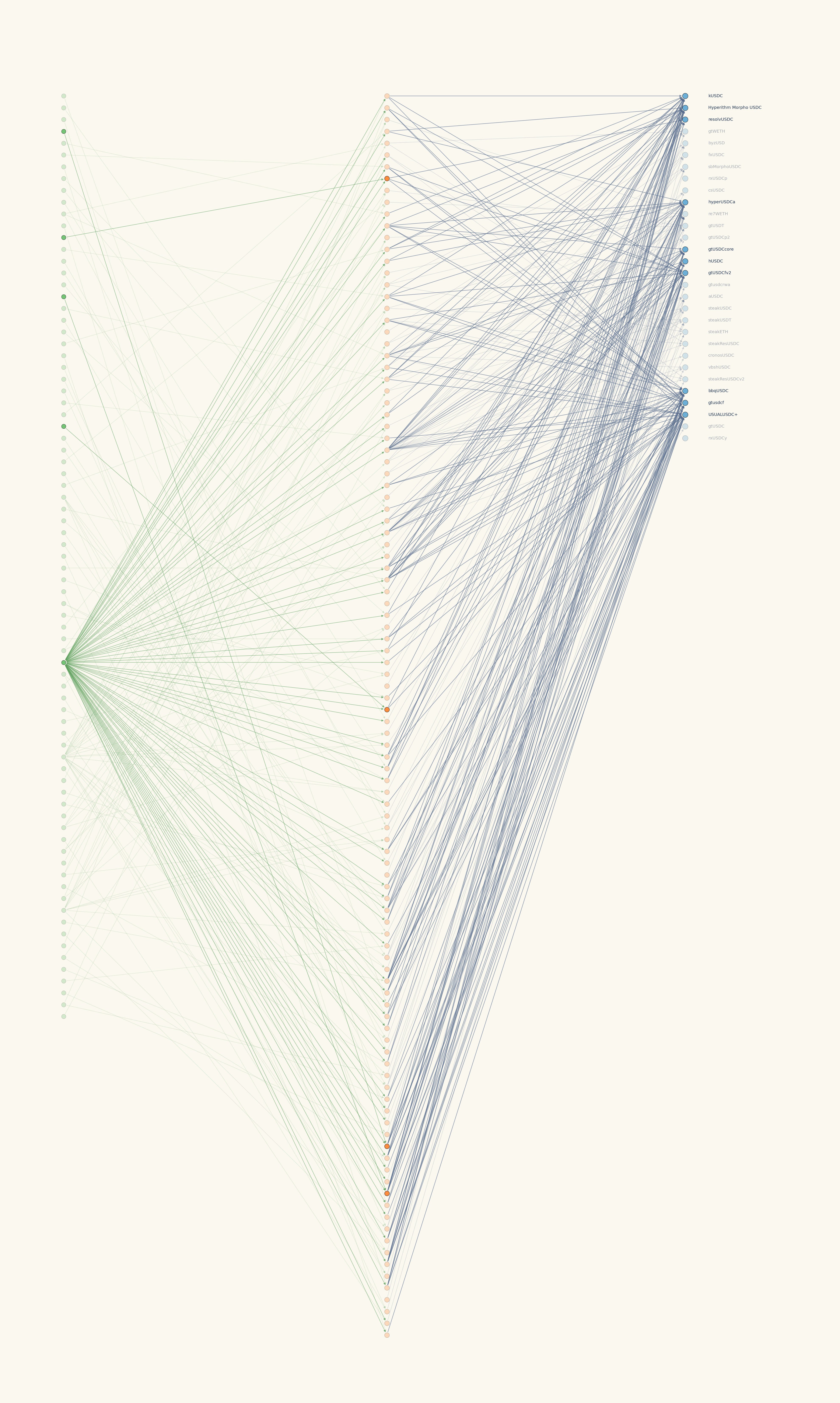
This approach allows us to programmatically analyze which assets are connected to which markets, which markets share the same underlying tokens, and where large dependency hubs emerge.
The idea of representing financial systems as graphs has a long history in risk management. In his 1998 paper on hierarchical structure in financial markets, Mantegna showed that the topology induced by a correlation matrix can reveal an economically meaningful taxonomy of assets. The relevant insight is not limited to equities: assets that appear distinct can still be manifestations of shared underlying forces.
The failure of diversification is often a failure to recognize that assets are not independent objects, but manifestations of shared economic forces.
For onchain markets, the same principle applies with even greater force. Composability creates explicit dependency paths, giving asset managers an highly granular view on categories of risk.
The Adjacency Matrix
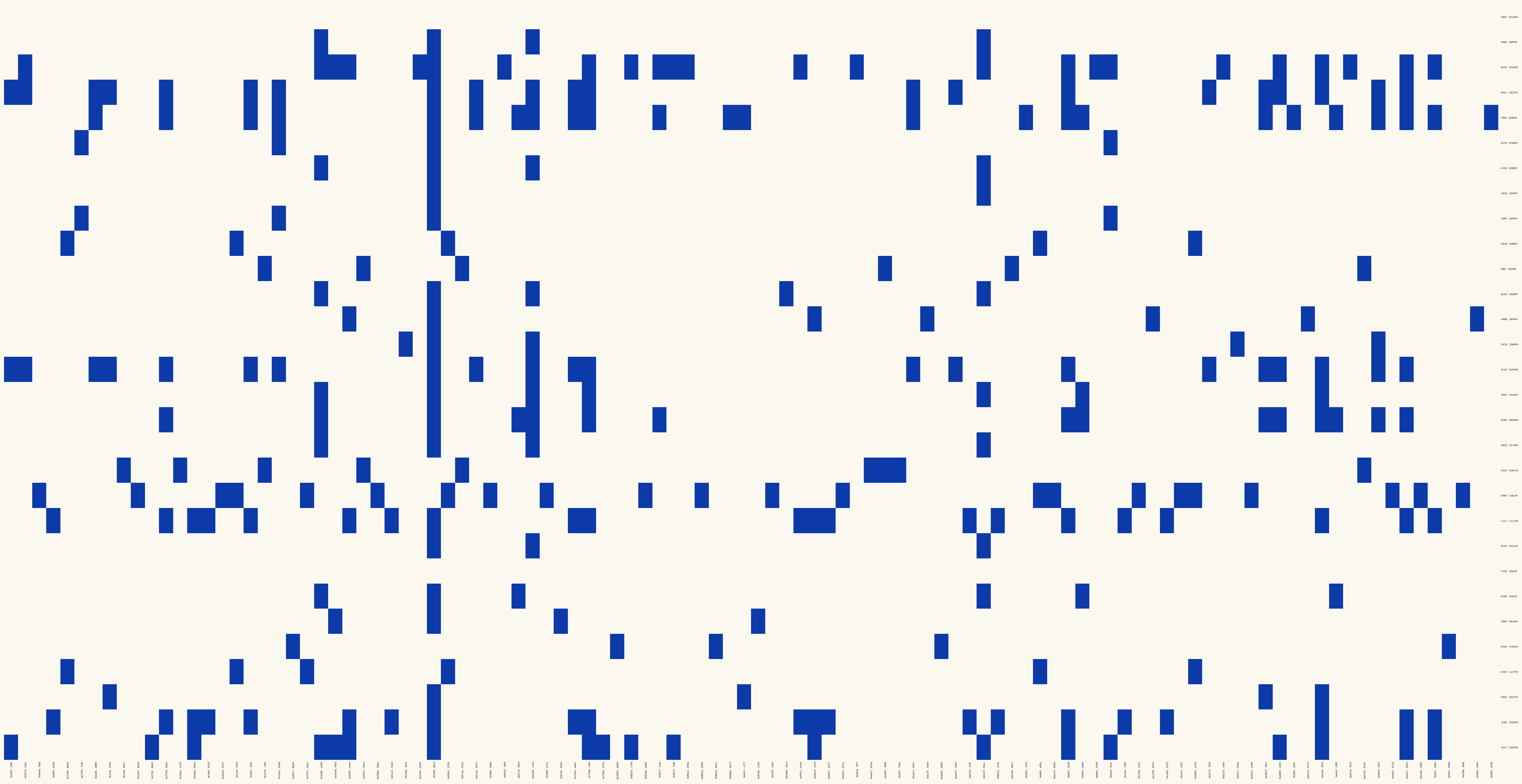
A graph is useful visually, but the same information can also be represented as an adjacency matrix.
An adjacency matrix is a simple object: rows and columns are nodes, and each cell indicates whether a dependency exists between two nodes. If a market routes into an asset, the corresponding cell is active. If two markets are used by the same asset set, this relationship can also be measured.
This gives us a machine-readable foundation for risk analysis. Once the system is represented as a matrix, we can compute overlap, dependency concentration, shared markets, and clustering.
In practice, this turns our analysis from a qualitative diagram into a quantitative risk primitive.
Concentration Risk Is Not Always Visible
The main risk highlighted here is hidden concentration.
An allocator may believe they are diversified because capital is spread across many assets. But if those assets route through the same small set of markets, depend on the same collateral type, or share the same liquidity venue, the effective exposure is more concentrated than the asset count suggests.
The analogy in equity markets is familiar from multi-factor models: a portfolio can hold dozens of stocks yet still carry concentrated industry exposure. Names differ, but if most positions load on the same sector factor, risk is driven by one macro bet, not by independent stock selection. Onchain topology plays a similar role: many assets can mask a small number of shared dependency factors.
This is the core limitation of naive equal-weight allocation, as it creates an illusion of diversification: many asset names, but fewer true sources of risk.
From Stress Tests to Topology-Aware Allocation
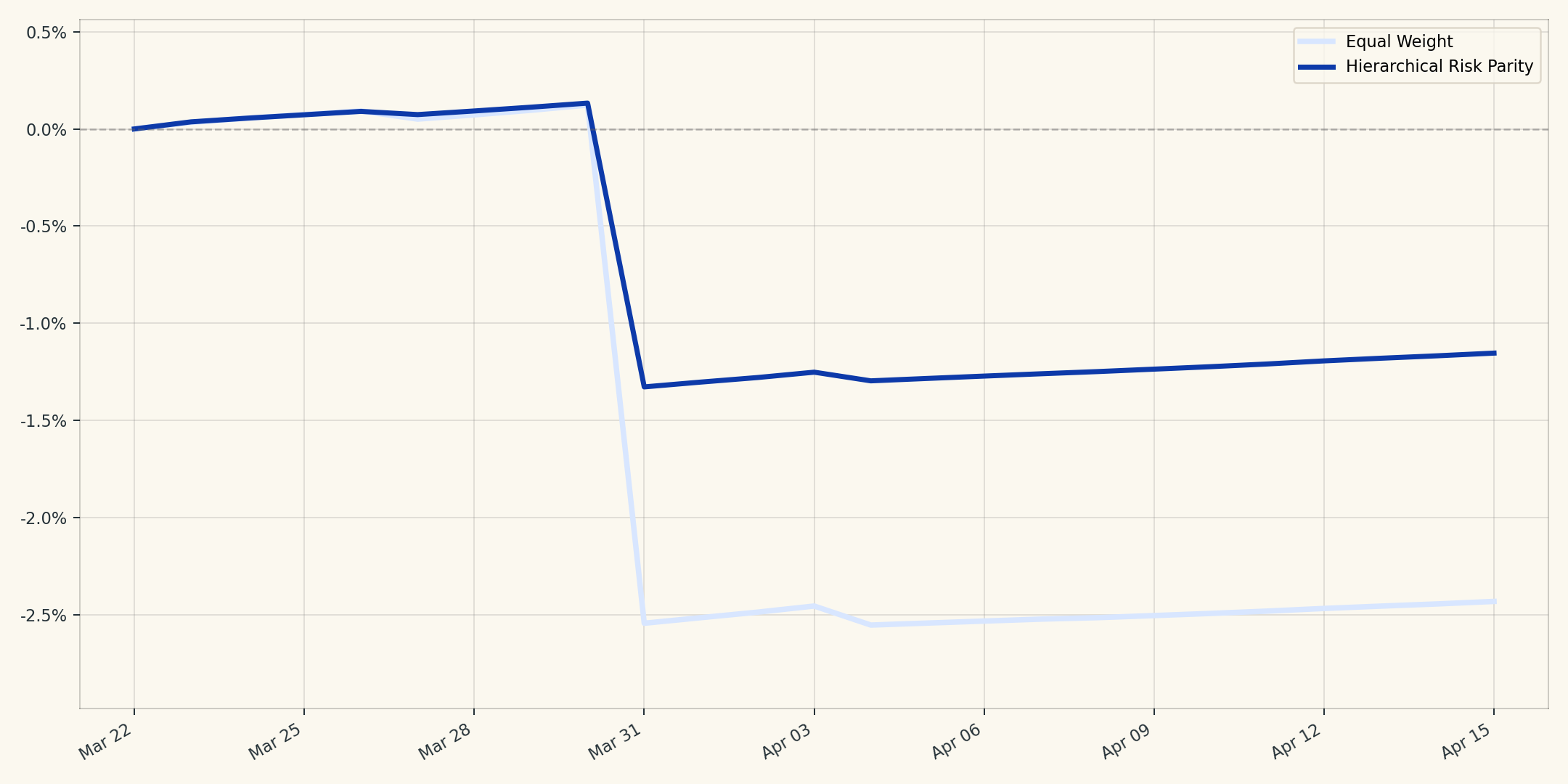
A simple example makes the point concrete. Suppose eleven onchain assets share exposure: ten route through the same Resolv-linked market cluster, and one sits outside it as a control.
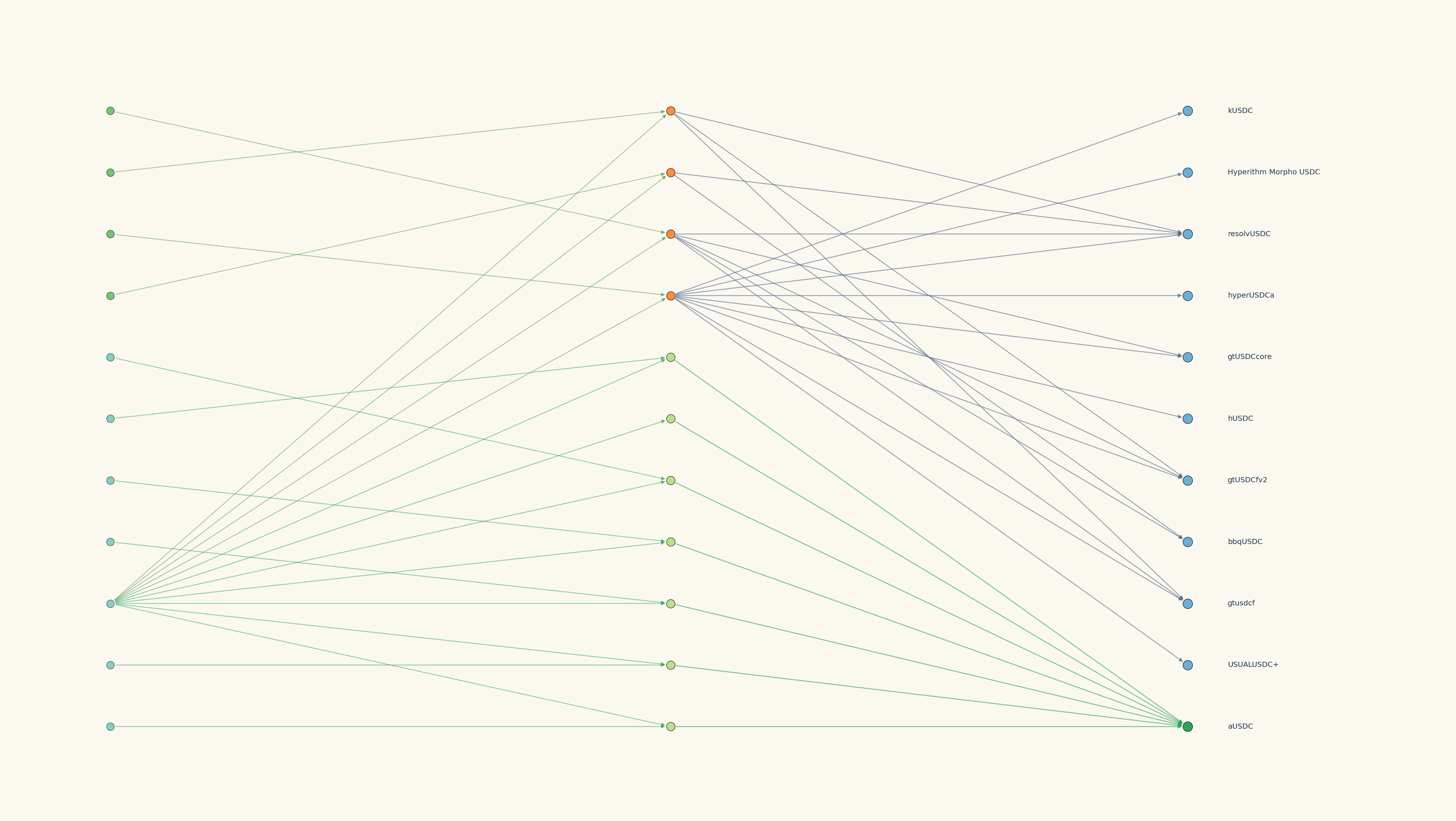
The allocation implication is to move from equal weight across names to risk budgeting across dependency clusters, using tools such as hierarchical risk parity to group similar exposures before sizing capital. In composable onchain markets, where hubs and shared rails can accumulate quickly, this structural view is table stakes. It is how allocators distinguish balanced-looking portfolios from genuinely diversified ones before stress reveals the difference.
Conclusion
Topology gives allocators a clearer map of onchain risk: hidden concentration, shared dependencies, and clustering that do not show up in simple allocation tables.
The business implication is direct. Diversification should be measured across true sources of risk, not merely across asset names. Equal weight can look balanced while capital remains structurally concentrated.
At Orion, we are building the risk framework for disciplined allocators who need to understand what they own, what those positions depend on, and where exposures overlap before stress events make the map obvious.
For quants looking to deploy systematic strategies onchain, Orion is designed as a one-stop shop: infrastructure to map dependency topology, tools to translate structure into allocation decisions, and execution rails to access onchain products with institutional-grade controls.
Orion Finance Research
References
- Mantegna, R. N. (1998). Hierarchical Structure in Financial Markets.
- López de Prado, M. (2016). Building Diversified Portfolios that Outperform Out-of-Sample. Journal of Portfolio Management. https://doi.org/10.3905/jpm.2016.42.4.059.
- Nicolini, C., Manzi, M., & Delatte, H. (2025). skfolio: Portfolio Optimization in Python.
- Tasche, D. (2005/2006). Measuring Sectoral Diversification in an Asymptotic Multi-factor Framework.